Building a Beautiful Responsive Members Page with Flex Cards

Ojas is a developer who loves to learn and document his journey. He is skilled in frontend development and intermediate in backend development. He is currently exploring web3 technologies and learning blockchain technologies.
Hello everyone, in this blog I will show you how to create a members page with cards using display: flex.
So, here is a preview of what I am talking about.
So, we are going to make this page fully responsive which will adjust itself according to the width of the screen.
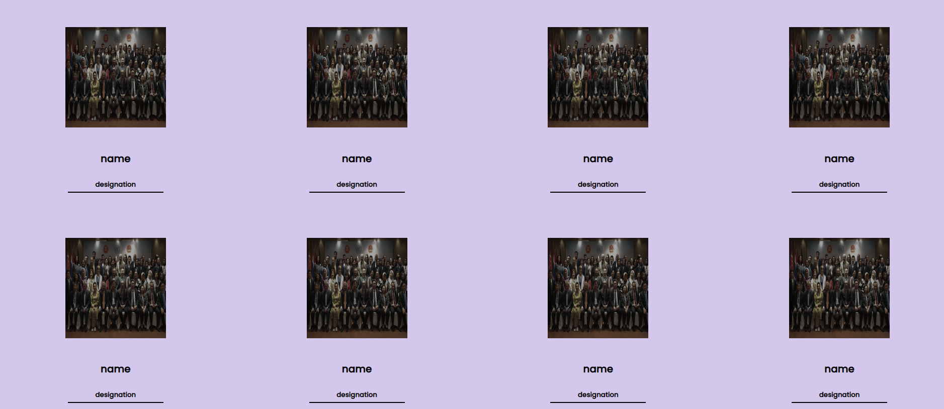
It will look like this –
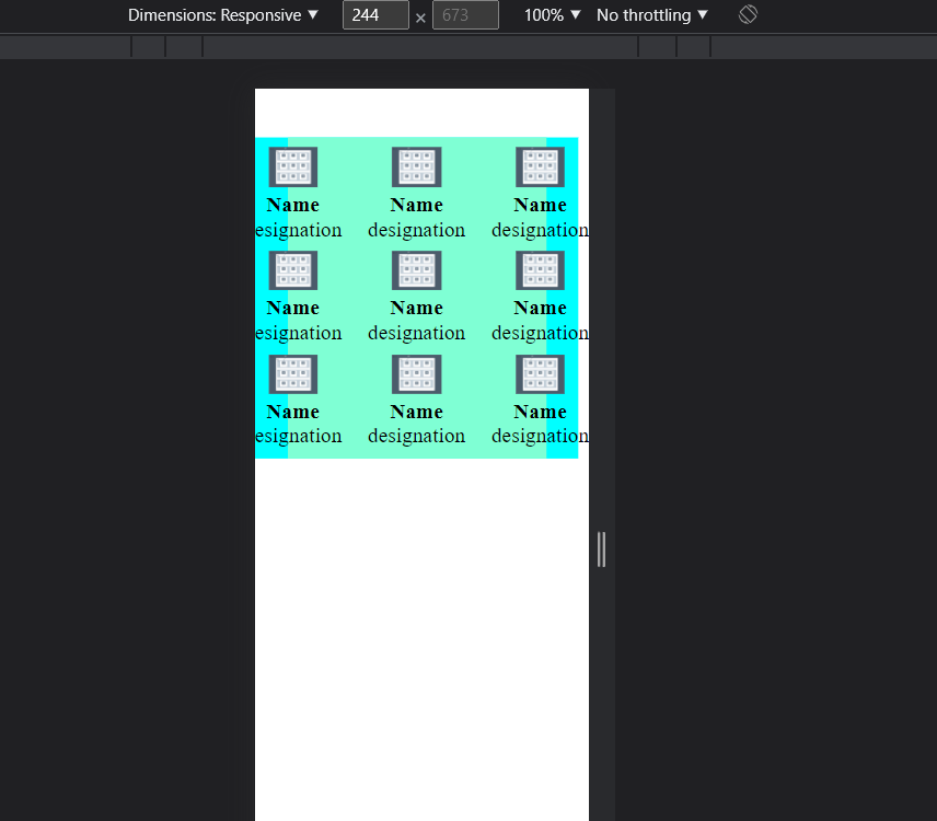
On desktop
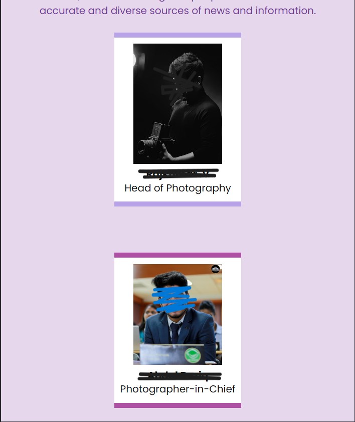
On Mobile
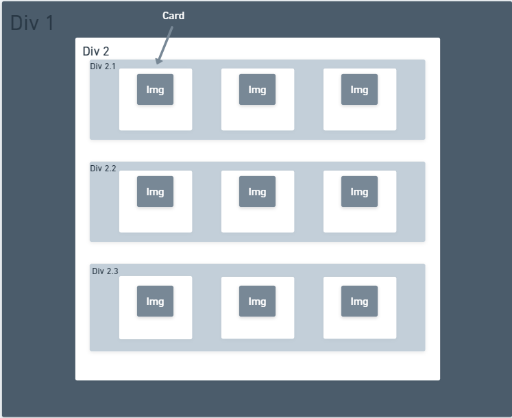
So, to start with, we have the basic HTML template here. We will add divs according to the following pattern:

Div 1 will be the outermost div which will be the basic div for the cards section.
Div 2 is used to provide margins and padding from top-bottom and side.
The divs 2.1, 2.2, and 2.3 are the divs that will be holding the cards. Each div will be containing 3 cards in this example.
Now, this is the basic structure and now we will create the card.
For that, we will be defining another div which let us call ‘card 1’. This will contain all the information which you need on a card. For example, Image, Name, and Designation.
You can refer the following code for the above image.
<div class="div1"> <!--Main Section-->
        <div class="div2"> <!--Sub Section-->
            <div class="div2-1"> <!--Card Line 1-->
                <div class="card1"> <!--Card-->
                    <img src="" alt="">
                    <h4>Name</h4>
                    <p>designation</p>
                </div>
                <div class="card2"><!--Card-->
                    <img src="" alt="">
                    <h4>Name</h4>
                    <p>designation</p>
                </div>
                <div class="card3"><!--Card-->
                    <img src="" alt="">
                    <h4>Name</h4>
                    <p>designation</p>
                </div>
            </div>
            <div class="div2-2"><!--Card Line 2-->
                <div class="card1"><!--Card-->
                    <img src="" alt="">
                    <h4>Name</h4>
                    <p>designation</p>
                </div>
                <div class="card2"><!--Card-->
                    <img src="" alt="">
                    <h4>Name</h4>
                    <p>designation</p>
                </div>
                <div class="card3"><!--Card-->
                    <img src="" alt="">
                    <h4>Name</h4>
                    <p>designation</p>
                </div>
            </div>
            <div class="div2-3"><!--Card Line 3-->
                <div class="card1"><!--Card-->
                    <img src="" alt="">
                    <h4>Name</h4>
                    <p>designation</p>
                </div>
                <div class="card2"><!--Card-->
                    <img src="" alt="">
                    <h4>Name</h4>
                    <p>designation</p>
                </div>
                <div class="card3"><!--Card-->
                    <img src="" alt="">
                    <h4>Name</h4>
                    <p>designation</p>
                </div>
            </div>
        </div>
    </div>
Now, we will style it.
First, make the padding and margin of the body 0. Then we will arrange the card lines using display flex. Now, we will apply display flex on div2, then we will apply justify-content to the center. To align the text inside the card, we can apply text-align to the center. Now, by default, the flex-direction is on the row. But for a better understanding, we will apply flex-direction to the row.
* {
    padding: 0;
    margin: 0;
}

.div1{
    background-color: aqua;
}

.div2{
    display: flex;
    justify-content: center;
    text-align: center;
    flex-direction: row;
    background-color: aquamarine;
    margin: 15% 10%;
    gap:10%;
}
Here I have given a gap of 10% between the cards. I have also added a background-color to show the divs. The margin is added to align the div into the center.
Before it was looking like this –

Now it looks like this –

So, this is the basic structure for the desktop. It will be responsive for a lot of widths as we have used % for margin which is a relative unit.
Now but when you see it in the mobile form, it will not look good!
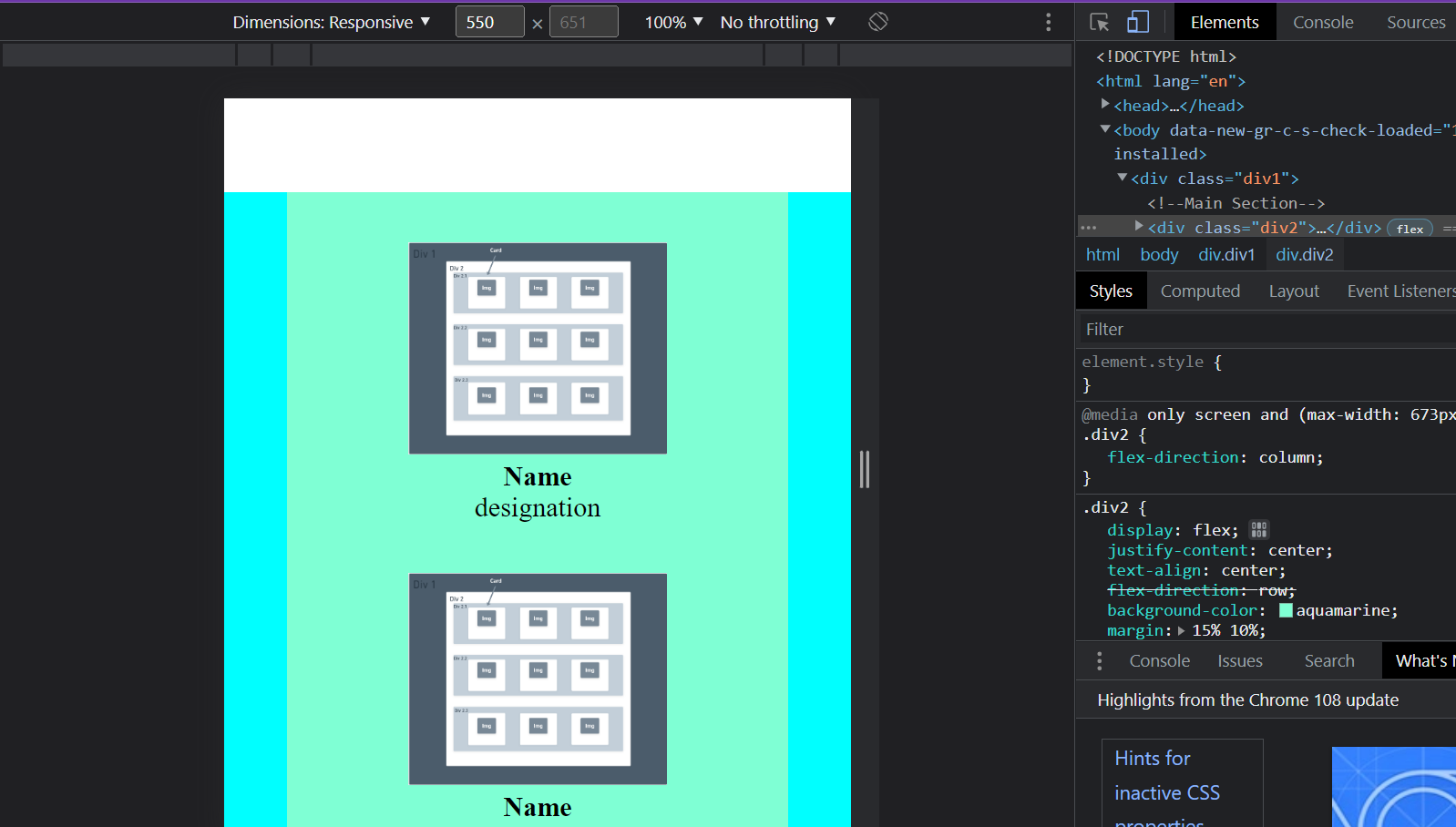
You can see it by right-clicking on the webpage and clicking on inspect element and then arranging the width.
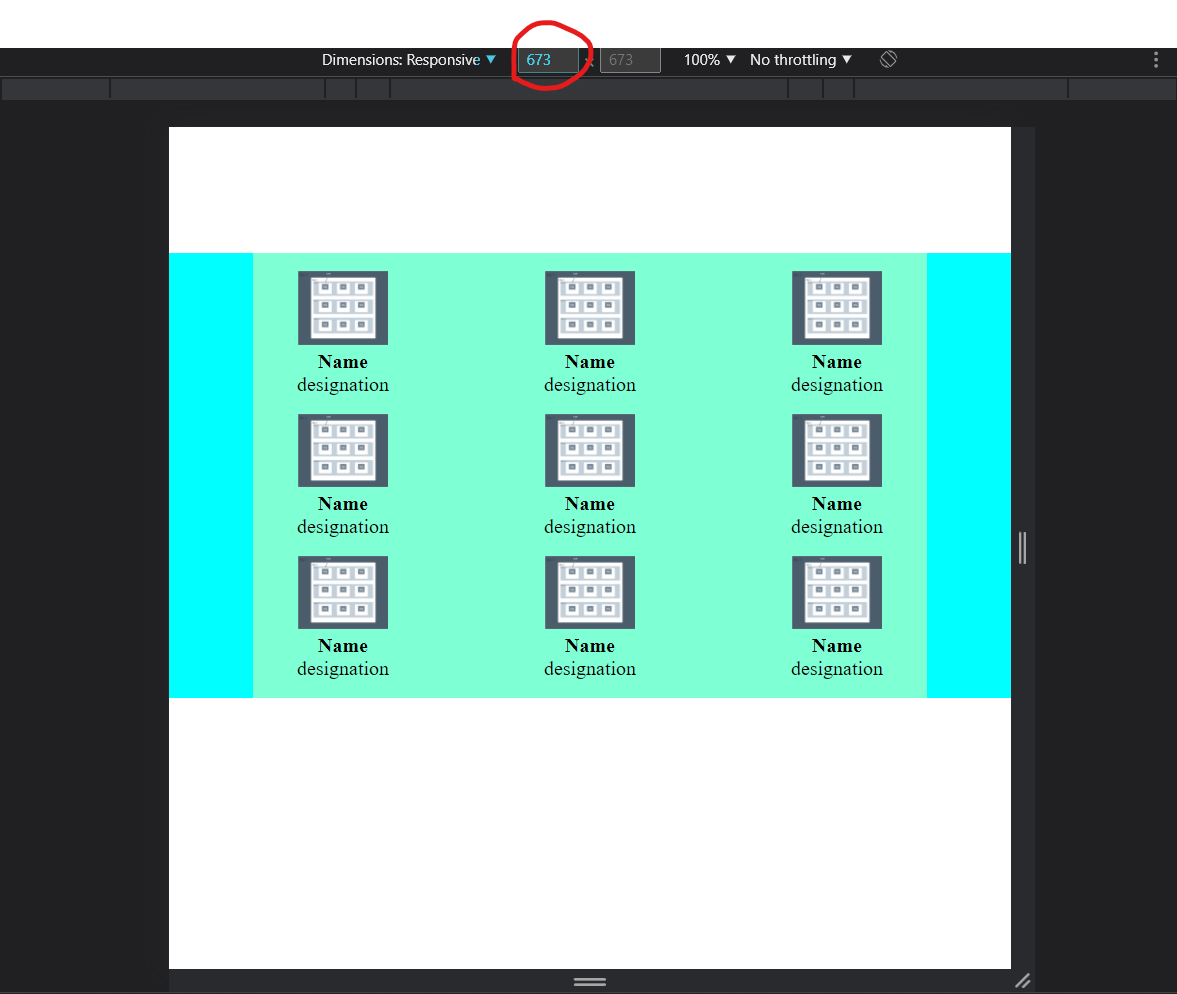
Here, it looks good till the width of 673px but below that, it doesn’t look good. Now I want to change the CSS such that it will look good on the screens with this small width. Here, I have also added the dummy image for better understanding.
For that, we will use media queries. Media queries is a technique in CSS 3 which allows the content to change according to different criterions such as max-width. In our project also, we are going to use max-width in the media queries and we will set it to 673px. Then, in that media query, we will change the flex-direction of div2 to the column which will show all the cards in the column instead of the row.
@media only screen and (max-width:673px) {
    .div2{
        flex-direction: column;
    }
}
After using a media query, the given format
Will be converted into

Now, our website will look like this on the smaller screen
And it will remain as it was on bigger screens.
We have done with the basic structuring and now you can style the cards as you want to.
* {
    padding: 0;
    margin: 0;
}

.div1{
    background-color: aqua;
}

.div2{
    display: flex;
    justify-content: center;
    text-align: center;
    flex-direction: row;
    background-color: aquamarine;
    margin: 15% 10%;
    gap:10%;
}

.card1, .card2, .card3{
    flex-direction: column;
    font-size: 5rem;
}

@media only screen and (max-width:673px) {
    .div2{
        flex-direction: column;
    }
}
.card1, .card2, .card3{
    margin: 10% 0;
    font-family: 'Franklin Gothic Medium', 'Arial Narrow', Arial, sans-serif;
}

.card1 img, .card2 img, .card3 img{
    width: 25vh;
    height: auto;
}

@media only screen and (max-width:673px) {
    .card1 img, .card2 img, .card3 img{
        width: 80%;
        height: auto;
    }

    .card1, .card2, .card3{
        font-size: 1.5rem;
    }
}
So, the two main CSS elements which we have used in the webpage are flex-direction and media queries.
Now, if you want you can add some more style to the cards.
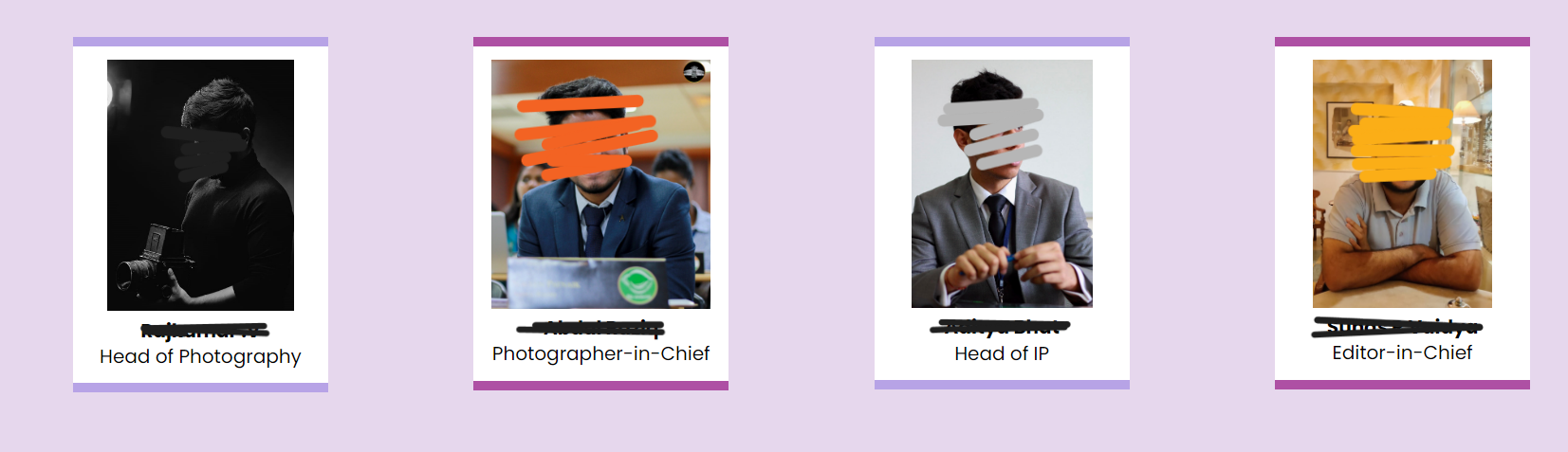
Here’re some examples

On hover

So, that is how we can create a responsive team members card webpage using flex and, in the flex, using flex-direction and media queries.
Thank you for reading the blog. You can refer to the code from the below GitHub repository.
https://github.com/ojasaklechayt/responsive-team-members-page


